
‘That much to change a mount!,’ carped my husband, when I asked him to pick up a picture I’d sent back to the framer. What he didn’t appreciate is that the swap to a slightly different shade of white enabled a sketch that had been lurking behind a chair to be hung on the wall – making it, in fact, money rather well spent, and neatly illustrating a point made by Dan Edwards, Framing Consultant and Director at Darbyshire, who works with numerous leading contemporary artists and galleries, that ‘bad framing can kill an artwork, whereas good framing can bring it to life.’ But deciding on style of frame from the huge variety available – or colour of mount – is not always straightforward, many of the rules are chiefly governed by opinion, and it can be an expensive process. The ideal is to get it right the first time, and, having consulted a range of experts, we can help – or at least submit possibilities and agreed guidelines.
Period, style, and trends
Framing serves purposes both of preservation and presentation, and when it comes to the latter, styles have evolved over the centuries. Once upon a time, explains Dan, when a tight salon hang was customary practice, ‘an ornate gold frame was essentially a way of buying space on the wall, and, for an artist, of differentiating their work from another’s, and, potentially, making it appear more valuable.’
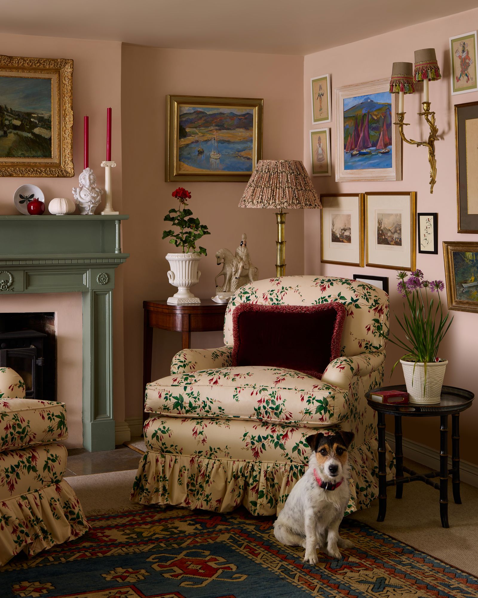
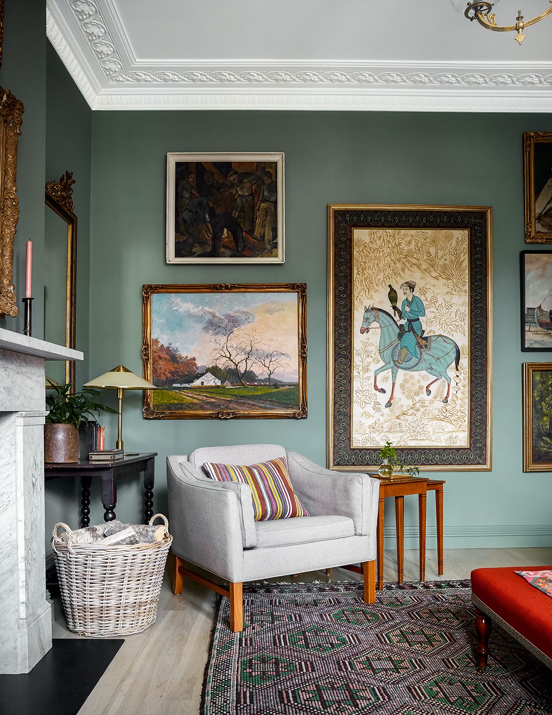
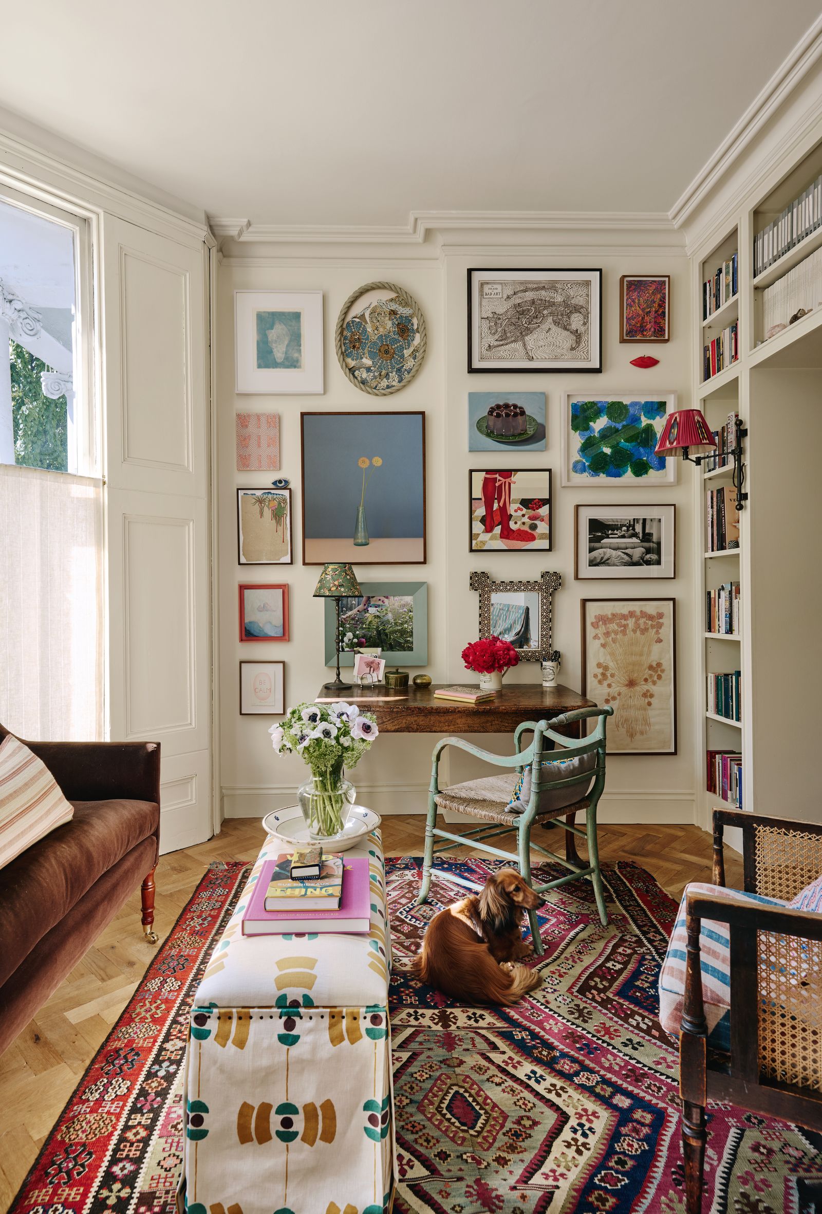
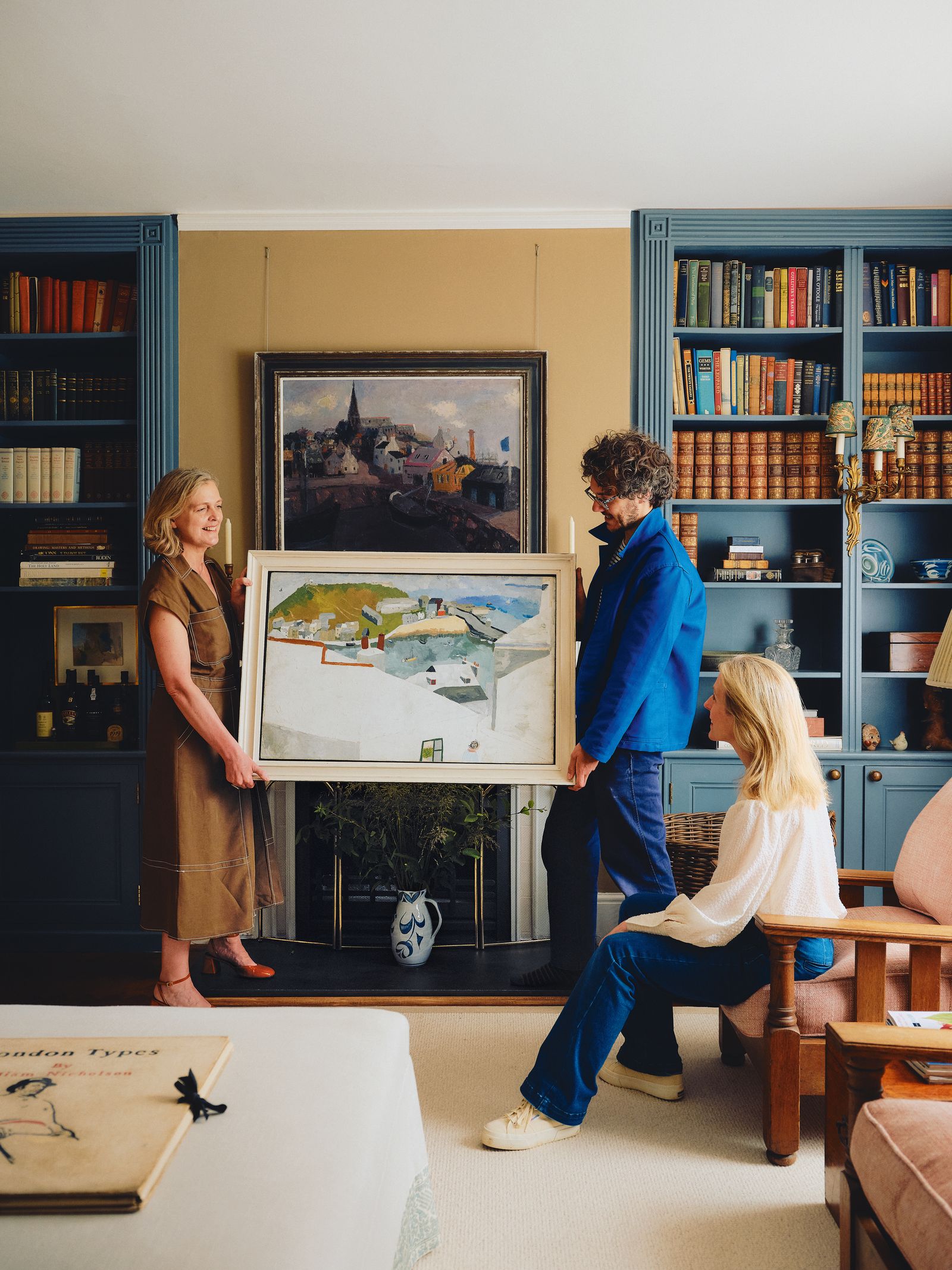
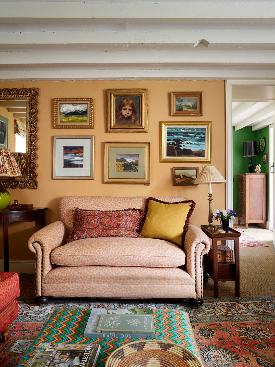
A frame is still a means of giving a work of art room to breathe, creating a considered break between it and the wallpaper or paint colour; indeed the artist Jemma Powell, who works with the framer Philip Elletson of P.R. Elletson, sees a frame as an extension of a painting, ‘the skin that carries the soul’. And there are still antique frames to be found, some of which, like antique furniture, carry fascinating stories within them; the artist Jaspar Galloway found himself, via Lots Road Auctions, in possession of a frame that had once provided a surround for a Picasso. There are also reproductions. But there are, too, more contemporary fashions: twenty-five years ago, at the height of Ian Shrager minimal hotel-chic, ‘everything was framed in white’, recounts Dan. Fast-forward to today, and he has noticed an increase in requests for brass and other metallics, as well as different types of wood. Alongside, there exist contemporary frames that are almost as ornate as their antique predecessors, whether through their unusual shape, carving, gilding, or being decoratively painted.
When pairing a frame with an artwork, there are differing schools of thought regarding concessions to period. Luke Rodgers of The Holwell Collection, who sources and restores antique frames, believes that ‘a painting is best matched by a contemporaneous frame.’ Philip agrees, adding, ‘if in doubt, go earlier.’ But equally, a frame can – literally – reframe, and Philip designs and makes examples that ‘have the same profile and shape as 16th, 17th, 18th or 19th -century frames, but might not have the heavy scrollwork or other detail, and they’ve probably got a different finish.’ Thus they appear sleeker, and as such can be a clever means of incorporating inherited 18th -century portraits or 19th -century landscapes into a more modern interior. Equally, Dan enthuses on what can be brought to a contemporary work by a frame that references period styles – while positing that, at the other end, and contrary to Luke and Philip’s views, an 18th -century portrait can take a more progressive contemporary frame, explaining that ‘sometimes a more minimalist style is quieter, which can seem more relaxed.’
Finding inspiration and direction
Inspiration might be sought at galleries (though at the National Gallery, do remember that some frames were designed to compete with the soaring proportions of places of worship) and exhibitions. Dan notes the younger commercial galleries in East London as good places to go if you’re in pursuit of the cutting edge, while Jenna Burlingham’s gallery in Kingsclere, Hampshire, is both an excellent resource for Modern British art, and, with the art displayed in a domestic setting, teeming with ideas for a more classical contemporary look. There are also the pages of this magazine.
It can be worth researching the artist whose work you own and seeing if they have or had confirmed ideas regarding the framing of their works. Josef Albers, for instance, gave his famous squares a very minimal narrow metal frame that didn’t interfere with colour interactions. And on purchasing a print by Cornelia Parker, I was directed to Pendragon Frames and advised of Cornelia’s preference for a floating mount.
The Frame: material, colour, proportion
‘For me, I feel that if someone notices the frame, I’ve got it wrong – though there are occasional exceptions,’ says Dan, who compares a work of art to catwalk couture, and a frame to “Savile Row tailoring, which draws attention to the person wearing it, rather than the garment itself.”’ Immediately identifying an exception, Philip cites some Leonardo da Vinci drawings, ‘that are in very heavy Venetian frames, and they look amazing. If you took them out and put them in something a quarter the size, I think you might wonder why you’d want to hang them on your wall.’ And Luke points out that an impressive frame ‘can give a vitality and importance to something that might, at first glance, appear ordinary,’ (which is compelling argument for elevating post-cards, menus or concert tickets, and rendering them jewel-like by the confection of their surround.)
Contained within those opinions is consensus that a frame should be chosen more for the artwork than the room it will hang in. So don’t match the colour to your sofa, and, counsels Nathan Barker of Jenna Burlingham, ‘be aware of the furniture: a room full of the same sort of wood, including on the walls, looks a bit log cabin.’ With this, a room can contain a multitude of different types of frame (though if you’ve got a print series that you’re hanging together, that could be given cohesion with the same framing treatment.) There are the earlier points about observing the period of the work of art – and size should be contemplated. ‘Generally, the smaller the work, the proportionally bigger the frame. If you’ve got a 6-inch or 8-inch 19th -century oil, I would put quite a heavy at least 3-inch frame on that,’ says Philip - before mentioning that there are, as ever exceptions.
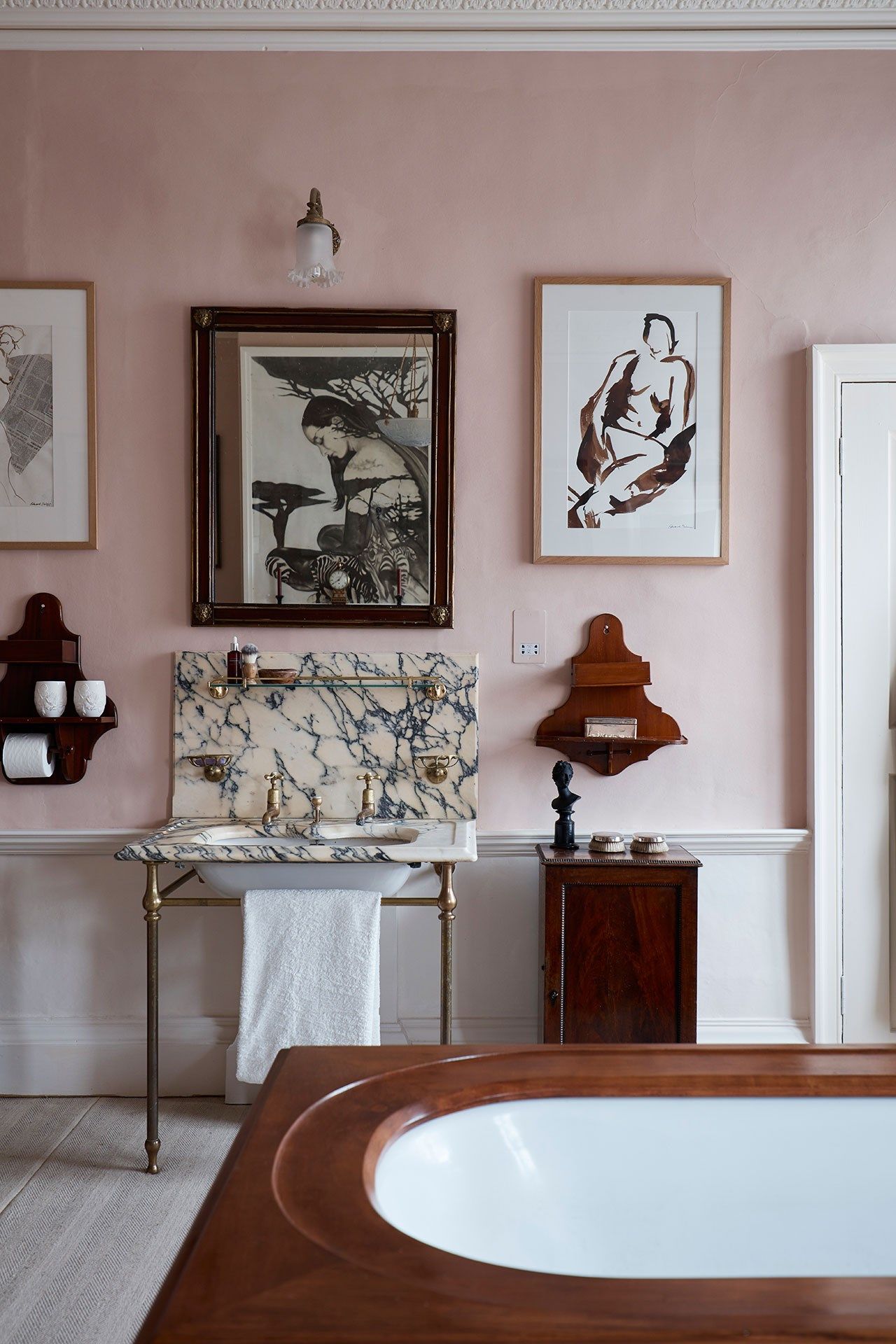
For contemporary works, black has become a popular go-to, and ‘if you’re framing black and white photography, it looks fantastic,’ notes Dan. But he suggests that for other artworks ‘sometimes a very dark brown can look better than black, as it’s not quite so dominating,’ he says. For works of any age you can, Philip suggests, take a colour from the painting, ‘but nothing too strong or obvious.’ And Dan explains that any coloured wooden frame should be stained (or slightly distressed) so that you don’t have a solid colour (which can look off-the-shelf.)
The other component parts: slips, mounts and glazing
Moving on, an oil painting wouldn’t traditionally have a mount - but, depending on date, it might have a discreet ‘slip’ or ‘fillet’, a separate inner part of the frame made of a non-gilded material such as canvas or linen, which became common practice in the 1920s. ‘Make sure it isn’t too white and so doesn’t stand out,’ says Philip, who notes that he will colour a slip with a wash to ensure neutrality, for ‘it’s a transitory item,’ he explains, in other words, a passage between the textural surface of the painting, and the frame.
A work on paper would have a mount. The classic is a window mount, ‘and with that, you want slightly more border on the bottom,’ ordains Dan. For a work that goes all the way to the edge of the paper, a floating mount might be preferable, and a spacer can be used so it stands up slightly. The size of the mount should relate to that of the artwork, and it again will probably benefit from an element of neutrality: ‘we most commonly use shades of white and off-white,’ says Dan. Vital is to look at it in daylight (which is where I went wrong with the mount that I had to change.)
But a mount can also add to overall visual impact: Philip might use a wash ‘so that you have a lighter inner, and a darker outer edge’ or add a thin gold line. Alternatively, a coloured mount can be employed, though ‘muted’, says Philip. Demonstrating again the range of views, Harry Eagle of Made by Harry Eagle reckons we should avoid colour mounts as we’ll tire of them, while Dan mentions that bright colours can look good against contemporary screen prints, and some artists will choose them for their works. But he adds a caveat: ‘a lot of the brightly coloured mounts are not conservation mounts’– which is a reference to the preservation of an artwork requiring an acid-free barrier. And an artwork should never be glued to a mount.
With that, it’s essential that any glazing does not touch the artwork. Oil paintings, generally, don’t need glass in front of them – unless they’re in a high traffic area, you’re preparing a painting for global travel (perhaps you’re lending it to an exhibition), or you’re planning to sit beneath it and smoke 60 Rothmans a day. Works on paper do need more protection – for they’re less resistant to light, dust, and humidity. There exist types of glass that offer various levels of UV filter and low-reflectivity, and, although they are more expensive than standard glass, to ignore them can be a false economy – particularly as, for a standard sized work, it’s probably only going to add 10% to the bill. There is also, points out Philip, Perspex, which at the top end can be ‘anti-dust, anti-reflection, anti-everything – and probably costs more than the frame itself.’ Notably, Perspex makes for a lighter picture (and, for the safety-conscious, is a secure choice for a child’s bedroom.)
Recommended framers and sources
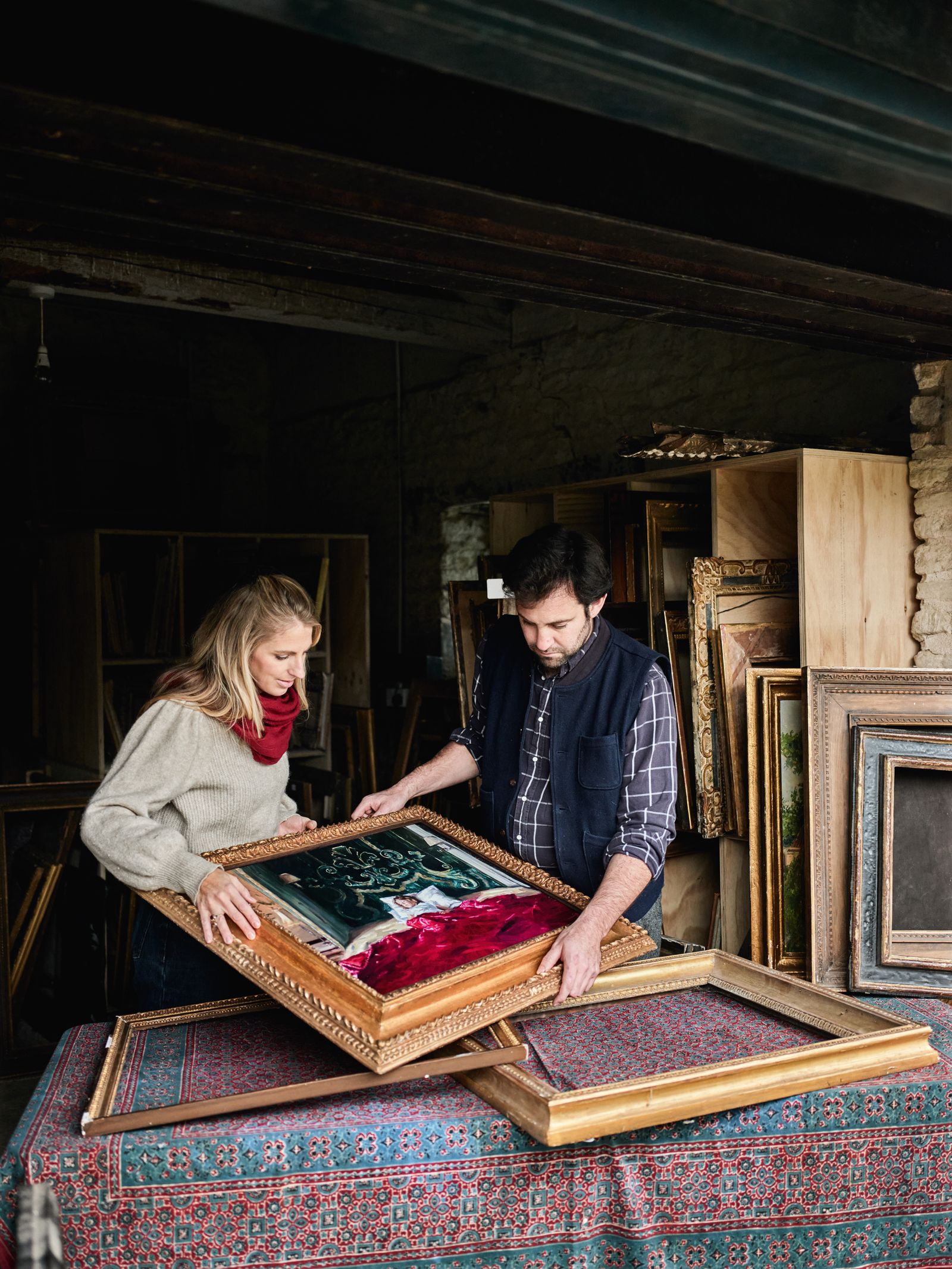
Framing’s being a method of preservation means that, sometimes, you need to take action before you have the funds: leaving an artwork rolled up in a tube will harm it. In those instances, eFrame can be a holding fix, and the above should have provided some ideas. But for further aesthetic input, and for long-term solutions, the framers listed below come highly recommend by artists, galleries, museums, interior designers, and House & Garden editors. Do check their specific areas of excellence before getting in touch or turning up – for some specialise in contemporary works, others in sourcing or recreating antique frames. Moreover, some are by appointment only, while others will travel, offer Zoom consultations, or can frame a work in situ (as Darbyshire recently did for several of David Hockney’s works at his show at the Fondation Louis Vuitton in Paris) - which is crucial information if you’re got a painting too big to leave your house. Wherever you go, we’ve one final piece of advice: ‘do try out different things,’ urges Luke Rodgers. ‘You might be surprised at what looks best.’
- Darbyshire; Islington, N1, and Stroud, Gloucestershire
- P.R. Elletson; Pewsey, Wiltshire
- Common Room Projects; Digswell, Hertfordshire
- The Lacy Gallery; Notting Hill, W11
- Made by Harry Eagle; Kensal Rise, W10
- Farang Wren Frames; Hackney, E8
- Frame London; Islington, N1
- The Holwell Collection; near Tetbury, Gloucestershire
- S’Graffiti; Stoke Newington, N16
- J.M. Smith Framing; Bristol
- Pendragon Frames; Seven Sisters, N15
- The Rowley Gallery; Kensington, W8
- Hawkins Framing; Sydenham, SE26
- We Are Facility; Haggerston, E8
- J White Framing; North Kensington, W10


